Parkinson's Africa
Visit: parkinsonsafrica.org
When Parkinson's Africa contacted us they were using Wix for their website, they had made a good start, but the platform was falling short and not really meeting their needs.
The charity had already made progress in terms of planning, including the development of branding, a logo, and the selection of 'Poppins' as their chosen typography for the pages.
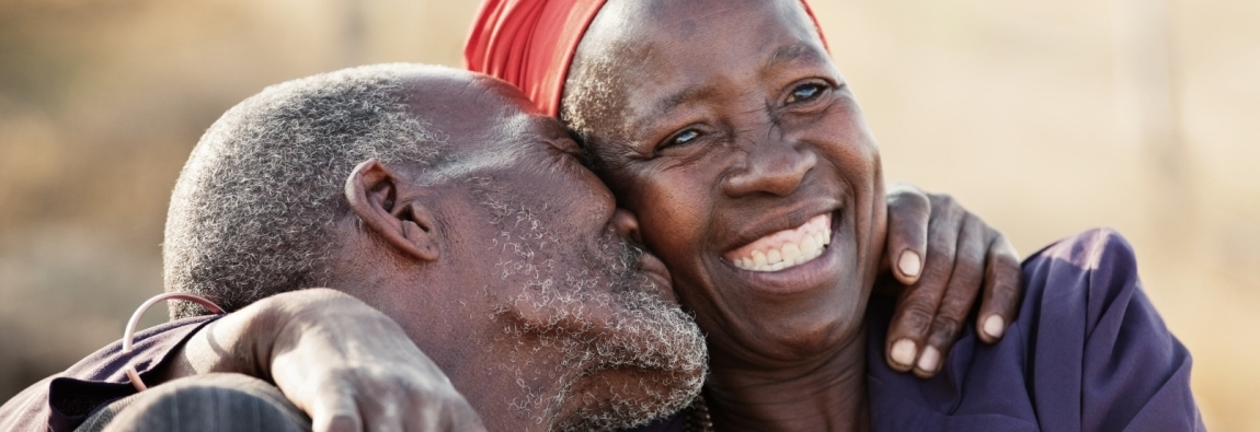
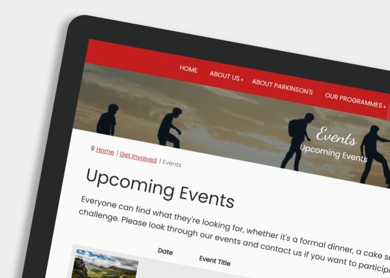
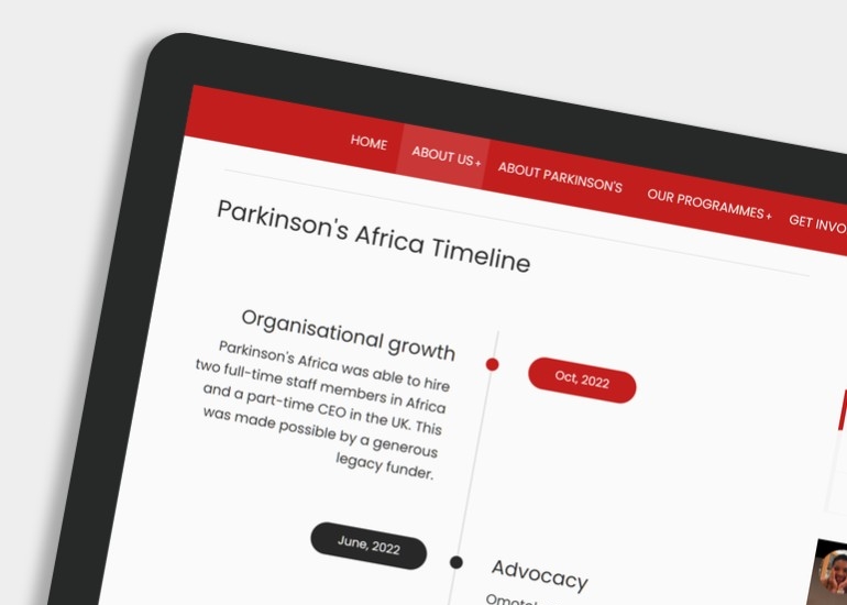
Regarding design, the charity expressed a desire for an uncluttered layout that prioritised ease-of-use and readability. They requested a homepage featuring a wide, possibly rotating masthead image that centrally displayed the logo and navigation. The color scheme was set to incorporate red, charcoal, and white.
To address the accessibility needs of certain visitors who might face challenges with mouse-based browsing, we focused on developing strong keyboard navigation.
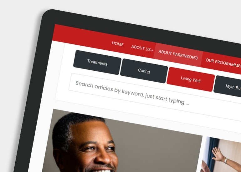
We implemented styled 'skip-links' to enhance page navigation and utilised smartmenus.js to create a primary drop-down menu. Smartmenus.js not only optimises keyboard navigation but also offers excellent support for various devices such as phones, tablets, and desktops. In addition, we designed the website's sub-navigation and content tabs with keyboard navigation in mind.
Web Design Award
Parkinson's Africa wins a Designrush 2024 web design award.
Read detailed journal post Watch video walkthrough
Tagged with: Bespoke Design, Donations, Responsive Design, Table of Content, Filters, Accessible Drop Down Menu, Tables, Events, Web Forms, Video Media, SEO, CMS, SSL.


